

1. Prepare the concepts
A master concept with a declared model (the column names matter — widgets and bindings refer to them):Concept: leads
Concept: leads_by_status
Concept: lead_info
2. The two reactive triggers
Alongsidebutton and form, run groups support:
load— runs once when the page first opens. Use it for data the user should see immediately, with no interaction.auto— runs whenever the values it binds to change (debounced, and only once every bound reference has a value). Use it for filters and drill-downs.
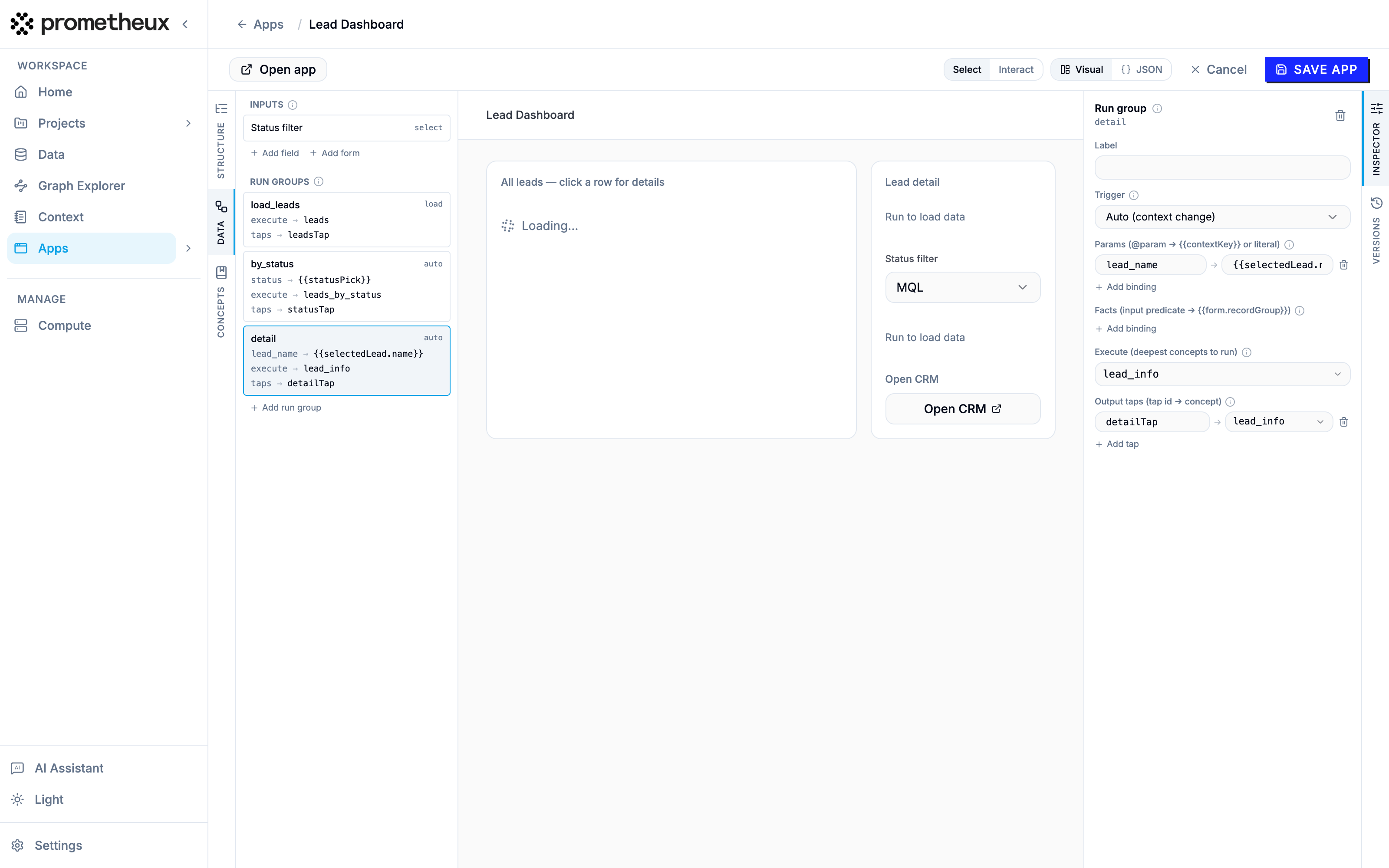
auto group:
Two kinds of reference appear here:
{{statusPick}}— a standalone input. Unlike form fields, a page-level input publishes its value continuously; anautogroup bound to it re-runs on every change. Because the input has adefault, the group also fires once when the page opens.{{selectedLead.name}}— a row selection. The master table below publishes its clicked row under the keyselectedLead; the dotted path reads the row’snamecolumn. Until a row is clicked the reference is empty, so the detail group simply doesn’t run.
auto trigger and the row-selection binding:
3. Layout: column stacks
So far we’ve used the defaultgrid layout (widgets flow onto a 12-column grid via span). For master–detail screens use layout: "columns": widgets declare which column stack they join (column: 1, column: 2, …) and the section’s weights sets the relative stack widths — [8, 4] gives a wide master and a narrow detail rail.
4. Table presentation
The master table demonstrates therich_table presentation pack:
columns— show a subset of the tap’s columns, in your order (here we hideemail).formatRules— conditional styling: rows wherestatusequalsMQLget a blue badge.columnFormats— value formatting per column:employeesrendered as a number.variant— chrome level:full(search, sort, export, pagination),compact(no search bar),plain(bare rows — right for key–value detail panels).onRowSelect— save the clicked row as a page variable, wiring the drill-down.
5. The whole app as JSON
load), and the right rail shows the MQL leads — the select’s default fired the auto group, no button anywhere:
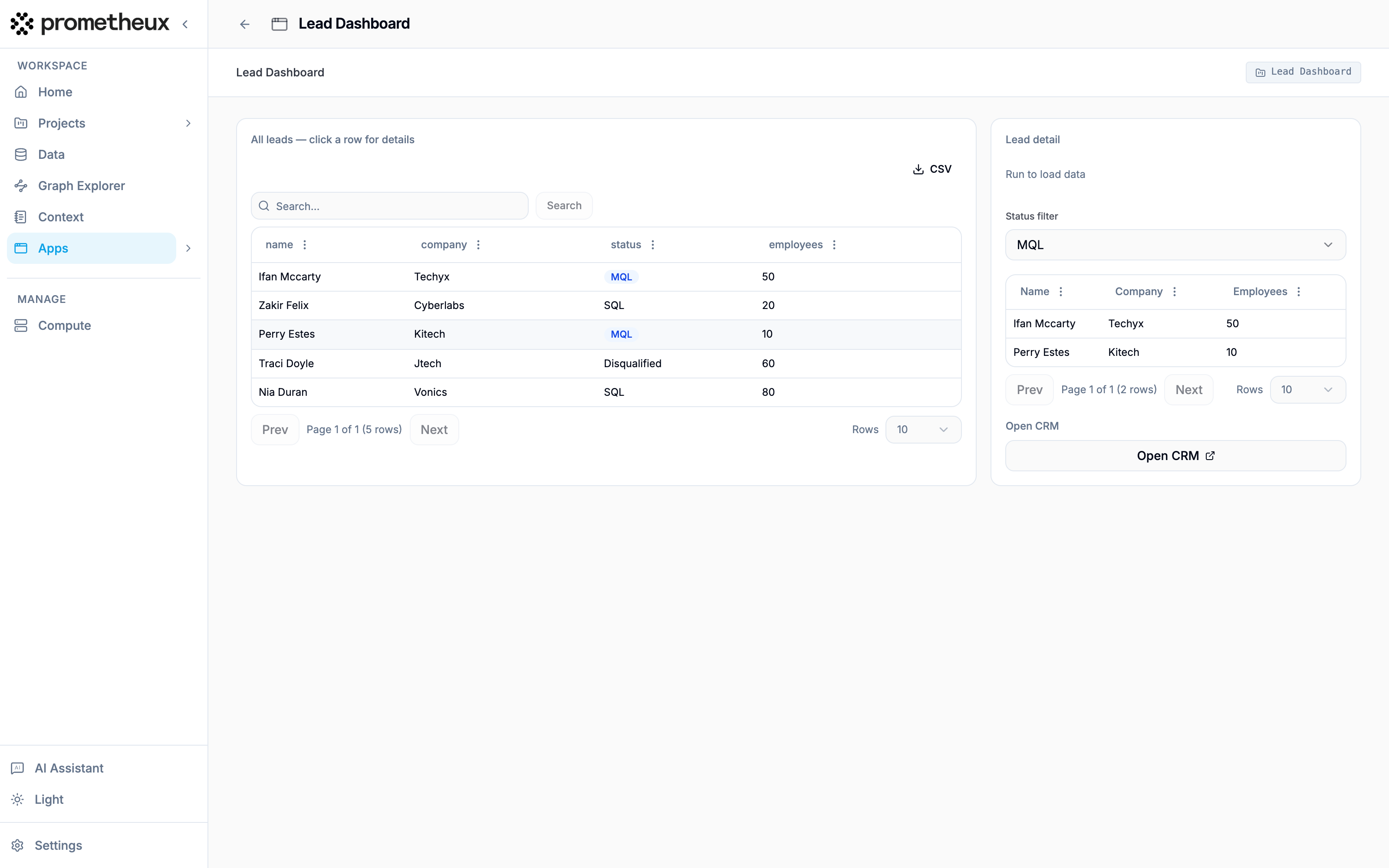 Changing the select re-filters the right-rail table, and clicking a lead row fires the second
 auto group — the detail panel fills in:
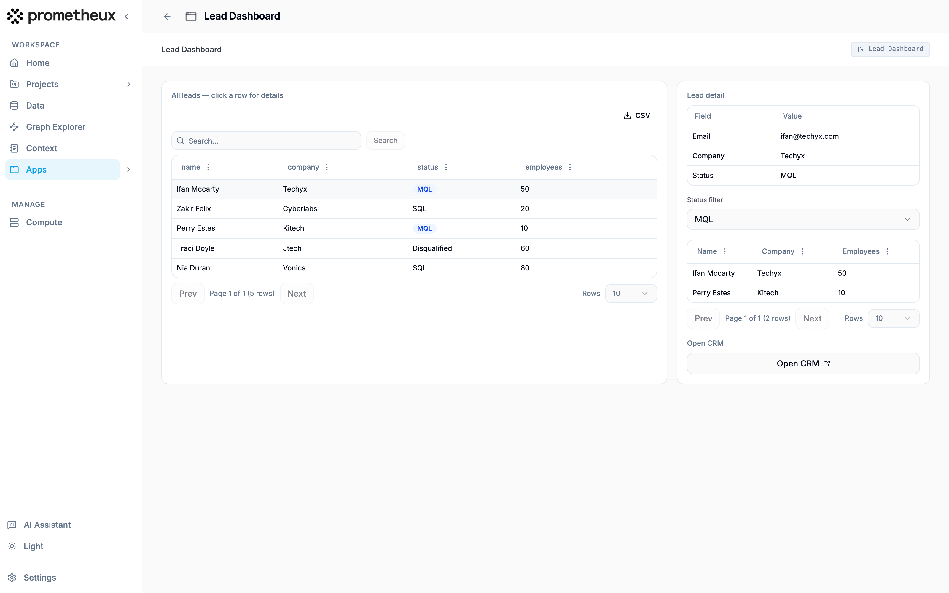
The generic button widget. The Open CRM button is a
button widget, not a run_button. Its action can open_url (link out), set_context (publish a value, as if a row had been selected), or run_group (re-fire any group — handy for a “refresh” button on a load group).